This post comes as a result of a comment a friend made about what he thought was a good idea for a /r/dataisbeautiful post: “Some kind of graph showing the correlation between the population of a country and the number of people that answered it in the countries of the world sporcle quiz.” he said in a WhatsApp message. I think he knew exactly what would happen once I saw that suggestion…
My grandfather used to work as a painter in a car garage. I remember him telling me that the sorts of people he worked with, mechanics and engineery types, had this quirk where if you were stuck with something, you simply had to stand in the middle of the shop looking puzzled. “What’s that you’ve got there? Oh let me have a look. Ah yeah, you see, what you need there…” And solutions to your problem would be offered up by these inquisitive minds.
Apparently, I suffer from the same problem, except with data.
Anyway…
Sporcle gives you access to the global results at the end of the quiz (I got 124 out of 197, managing to forget that Afghanistan and Colombia exist along the way). I’m well aware that this isn’t a representative sample of the global population. Judging by the Alexa results, Sporcle’s users are mainly in English-speaking countries like the UK, USA and Australia, so if anything this is a look at how well the English-speaking world knows the rest.
Next, population data: Wikipedia was my starting point. I headed on over to the [List of countries by population (United Nations)] (https://en.wikipedia.org/wiki/List_of_countries_by_population_(United_Nations)) article, and then converted the table to a CSV with this handy tool. There’s a couple of different articles with similar titles, but this one also includes labels of UN continental region and UN statistical region which will be useful later on when looking for regional effects on the “memorability” of a country.
After a bit of manual cleaning up of the data - things like removing British Overseas Territories and Crown Dependencies, adding Kosovo, renaming “Côte d’Ivoire” and “Macedonia” to “Ivory Coast” and “Republic of Macedonia” for consistency etc. - it was a simple case of joining the two tables together in R and outputting to a CSV file.
Here’s a sample:
| Country | Percentage Answered | UN continental region | UN statistical region | Population2017 |
|---|---|---|---|---|
| Afghanistan | 79.5% | Asia | Southern Asia | 35530081 |
| Albania | 64.5% | Europe | Southern Europe | 2930187 |
| Algeria | 71.6% | Africa | Northern Africa | 41318142 |
| Andorra | 66.2% | Europe | Southern Europe | 76965 |
| Angola | 58.9% | Africa | Middle Africa | 29784193 |
Full table is available here.
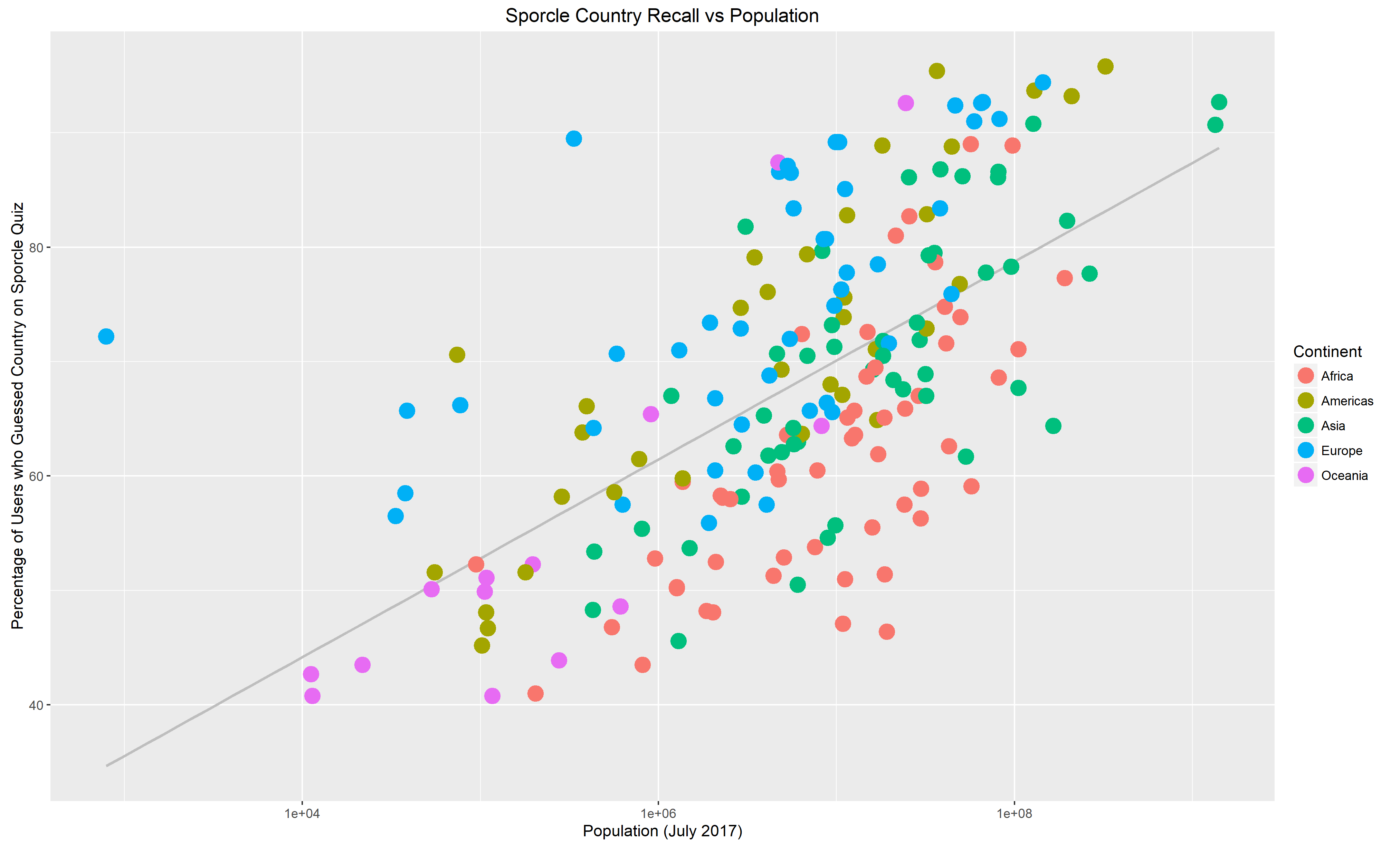
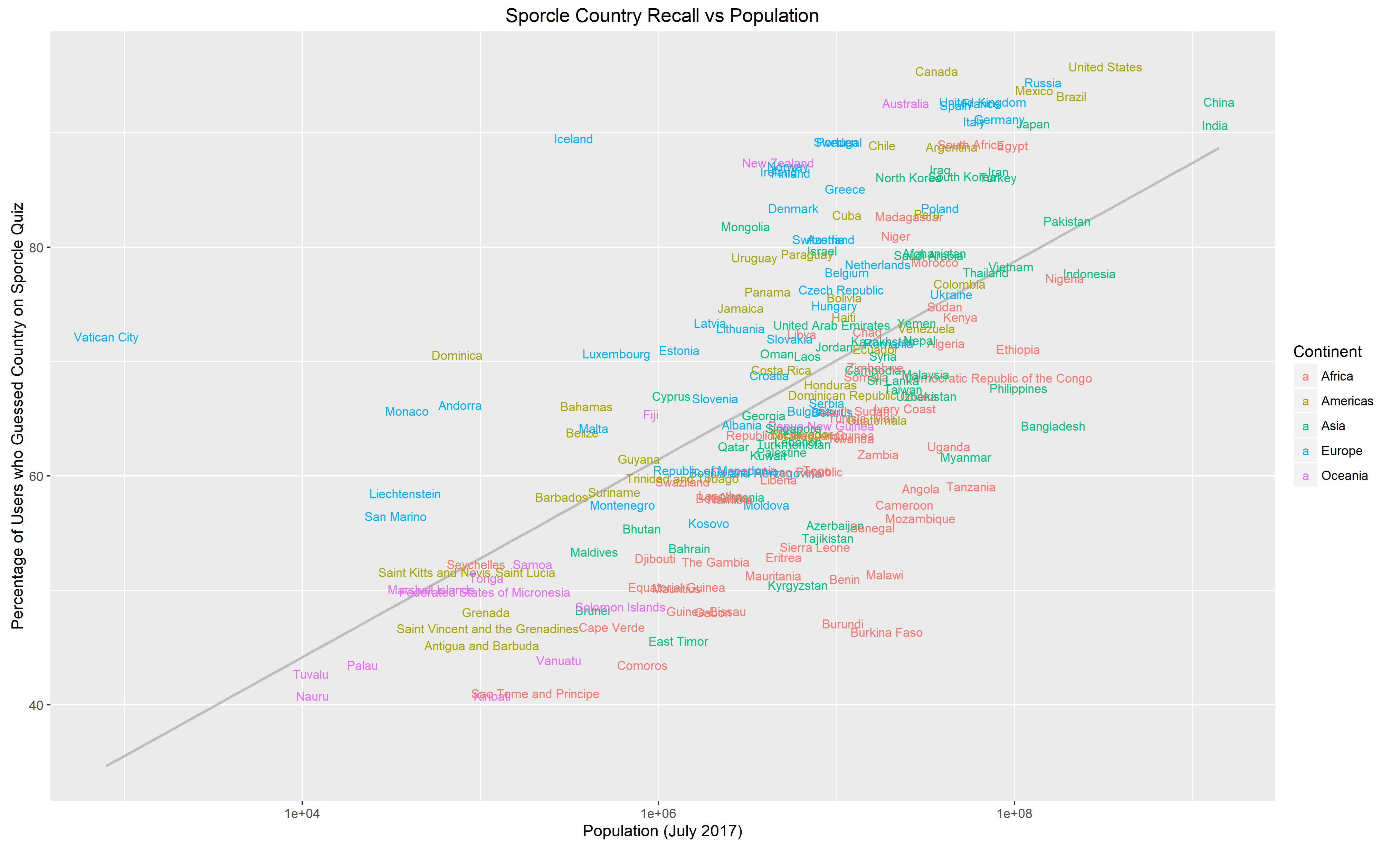
And finally some plots:
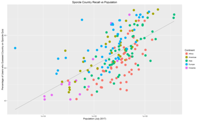
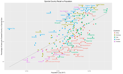

These are the same plots with differing labels.
The grey lines are a linear-regression of “Memorability” against population: countries above the line are more memorable than their population would predict, countries below the line, less memorable.
No real surprises here, the upper right region is dominated by the G20 countries with the bizarre outlier that is the Vatican over on the top left, and then the African states that apparently people forget exist.
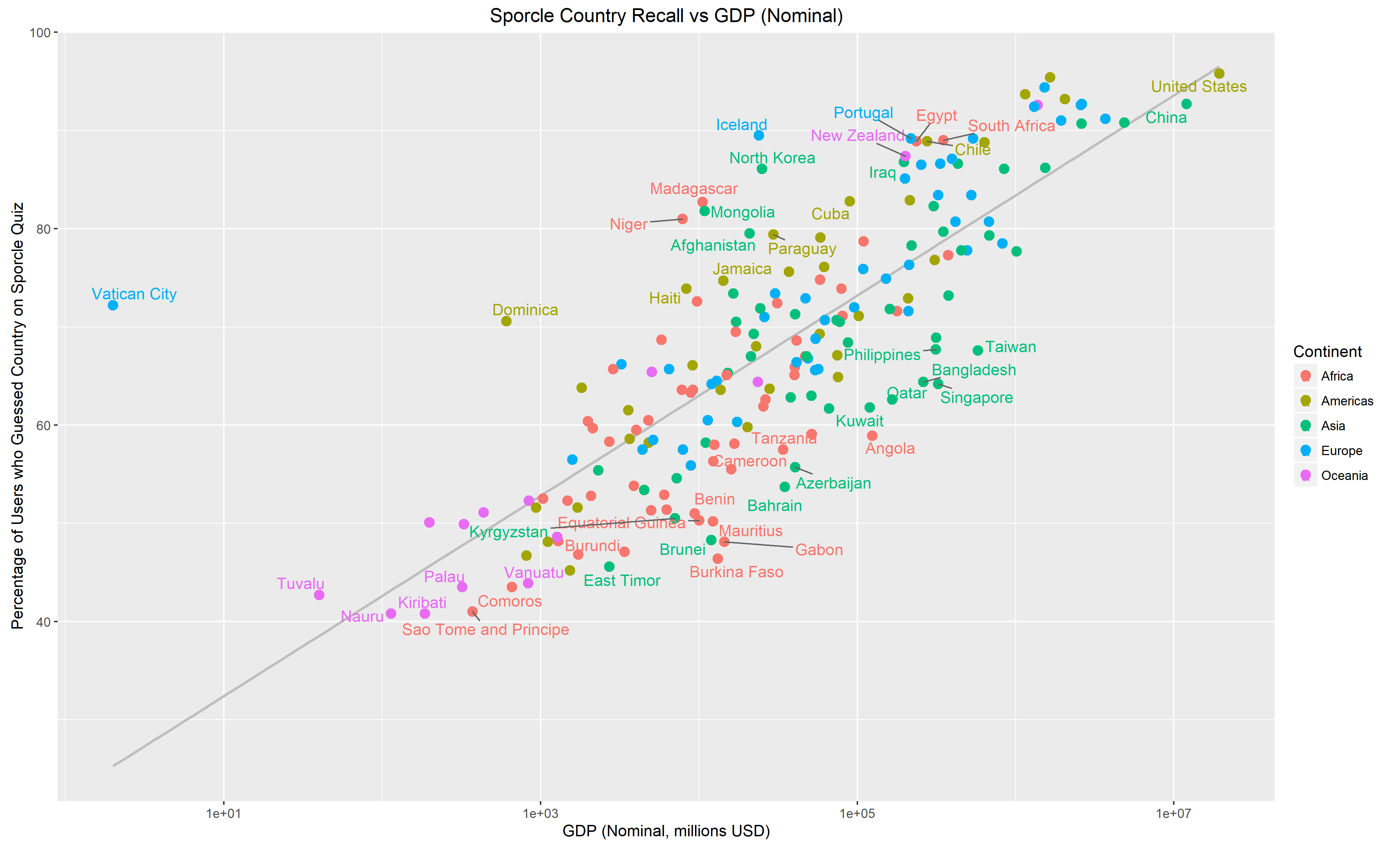
I posted these to /r/dataisbeautiful, where another user suggested that using GDP in place of population might yield some interesting results. I tried it out. Here’s the same plots as above but with Nominal GDP on the X-axis:
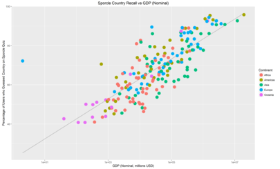

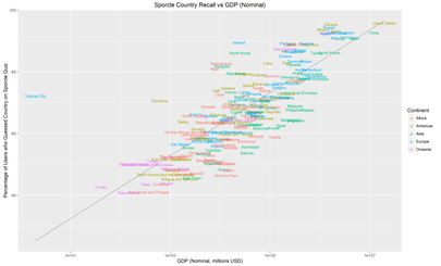
There’s a lot less spread here which suggets that GDP makes for a better predictor than population. Another user suggested that the reason for this is that Nominal GDP is relevant for international trade.
The R scripts for the two above sets of plots are here:
Sporcle-population.R
Sporcle-GDP.R
Finally, I did a bit of simple modelling in Stan to determine what the continent-level effects were, just a fixed-effects model with a Student-T residual:
$$ \text{Percentage Answered} \sim \text{Student}(\nu, \beta^\text{Continent} + \beta^\text{Population} \cdot log(\text{Population}), \sigma) $$
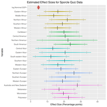
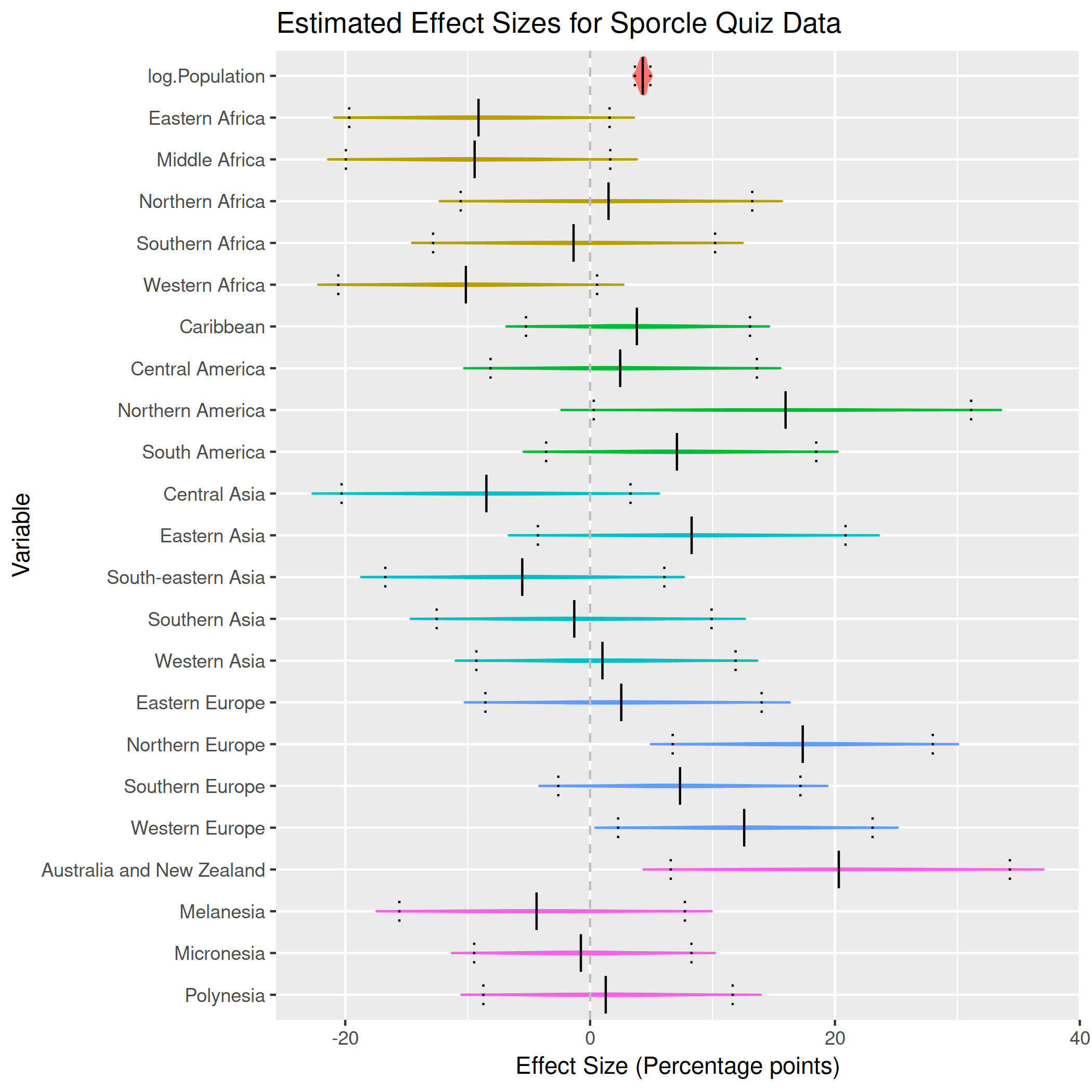
And similarly, using Nominal GDP:
$$ \text{Percentage Answered} \sim \text{Student}(\nu, \beta^\text{Continent} + \beta^\text{GDP} \cdot log(\text{Nominal GDP}), \sigma) $$
The Stan model file is here for interested parties, it’s the same for both models but with differing input data.
What’s important is the results. First, with population:
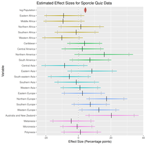
Here general geographic effects are evident, negative effects for Africa, positive effects for Europe and North America.
And then with GDP:
Arguably these results are more interesting: once the effect of GDP is removed, there’s not an awful lot of distance between geographic regions.
Finally, R scripts for doing the Stan analysis and plots are here:
Sporcle-stan-population.R
Sporcle-stan-GDP.R
I originally did this all back in June, but only just bothered to write it up.